Legible London signs aren’t perfectly placed
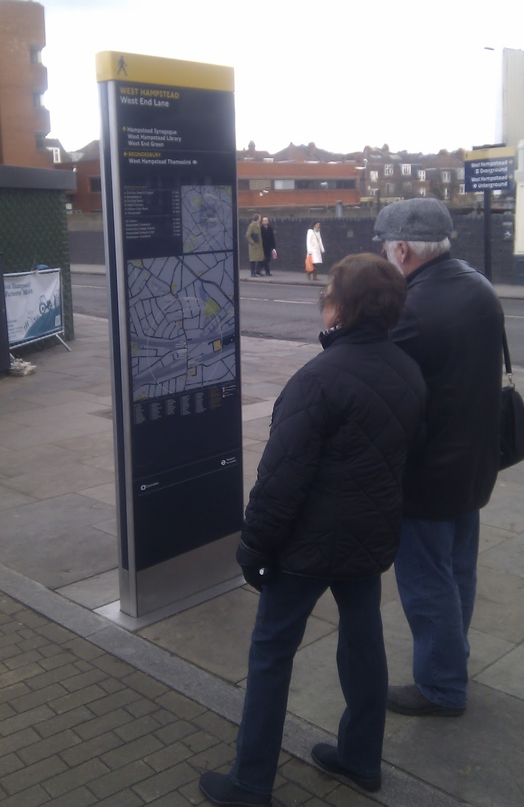
I first noticed the Legible London signs in West Hampstead when I almost walked smack into one that is inconviently in the middle of the entrance to the farmers’ market.

The signs popped up so stealthily that several people wondered if they’d been there all along and they’d just never noticed them.
The signs are a TfL initiative but are co-branded with Camden’s logo. Camden adopted the scheme back in 2008 and rolls it out across the borough when funding is available. However, the signs in West Hampstead were apparently funded by TfL to help with the interchange.
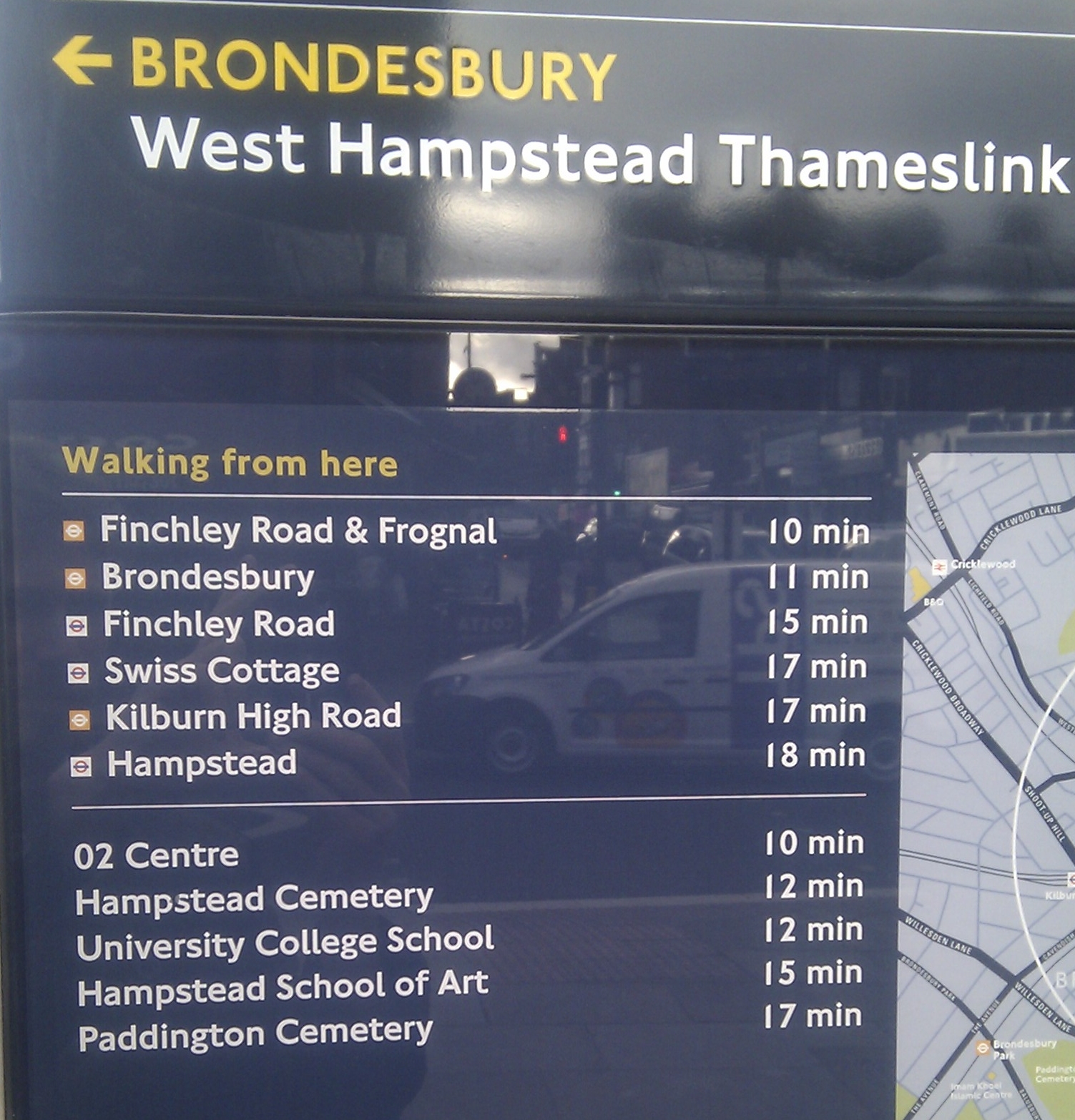
One of the ideas behind the signs is to encourage people to walk more. They give estimated walking times to transport links and some other arbitrary destinations (I confess to my shame that I’ve never heard of the Hampstead School of Art, which features prominently on our signs). There is also a wildly inaccurate and crude “5 minutes” circle, which is based on absolute distance from the sign and does not relate to street layout or terrain in any way whatsoever. Still, I’m all for people walking more if they can.
In central London these signs are extremely useful for visitors. They are oriented in the direction you’re facing rather than automatically north (though personally I find that more confusing).
But what of their location in West Hampstead. Are they really in the most sensible spots? Do we need so many? Who decides which destinations are highlighted? According to Camden council, it’s ultimately down to the Transport Policy and Design team to decide where the boards go, but there are several standard guidelines that are normally followed:
- Outside pedestrian entry points – mainly tube and train stations.
- Along high streets
- At key decision points – main junctions
- On footways with high pedestrian footfall
- Other factors affect where boards are placed such as footways widths and vehicle sight lines (ie. not blocking them)
I did a recce of the signs and I’m not at all sure they are in the optimum locations. Neither local councillors nor WHAT (West Hampstead Amenties & Transport) were consulted on the location, which seems a gratuitous oversight.
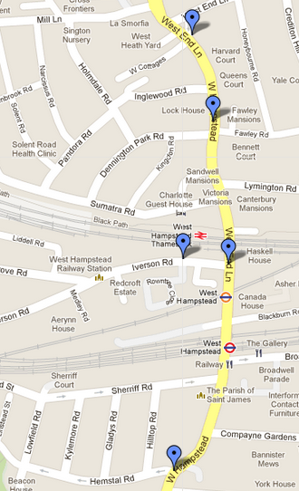
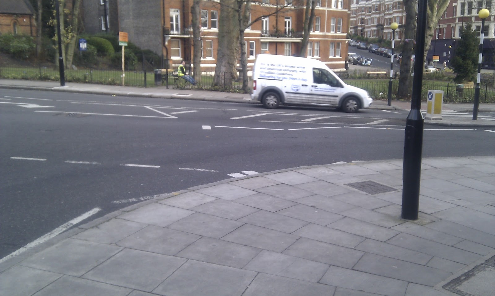
From the south, the first sign is on the corner of Hemstal Road and West End Lane, which seems rather a long way from the interchange. I guess if you’re walking to or from Kilburn then it might be useful, but people who don’t know the area are more likely to go the extra stop on the Jubilee Line or Overground, and if you’re on the Thameslink then you’d use Iverson Road to travel between Kilburn and West Hampstead.
 |
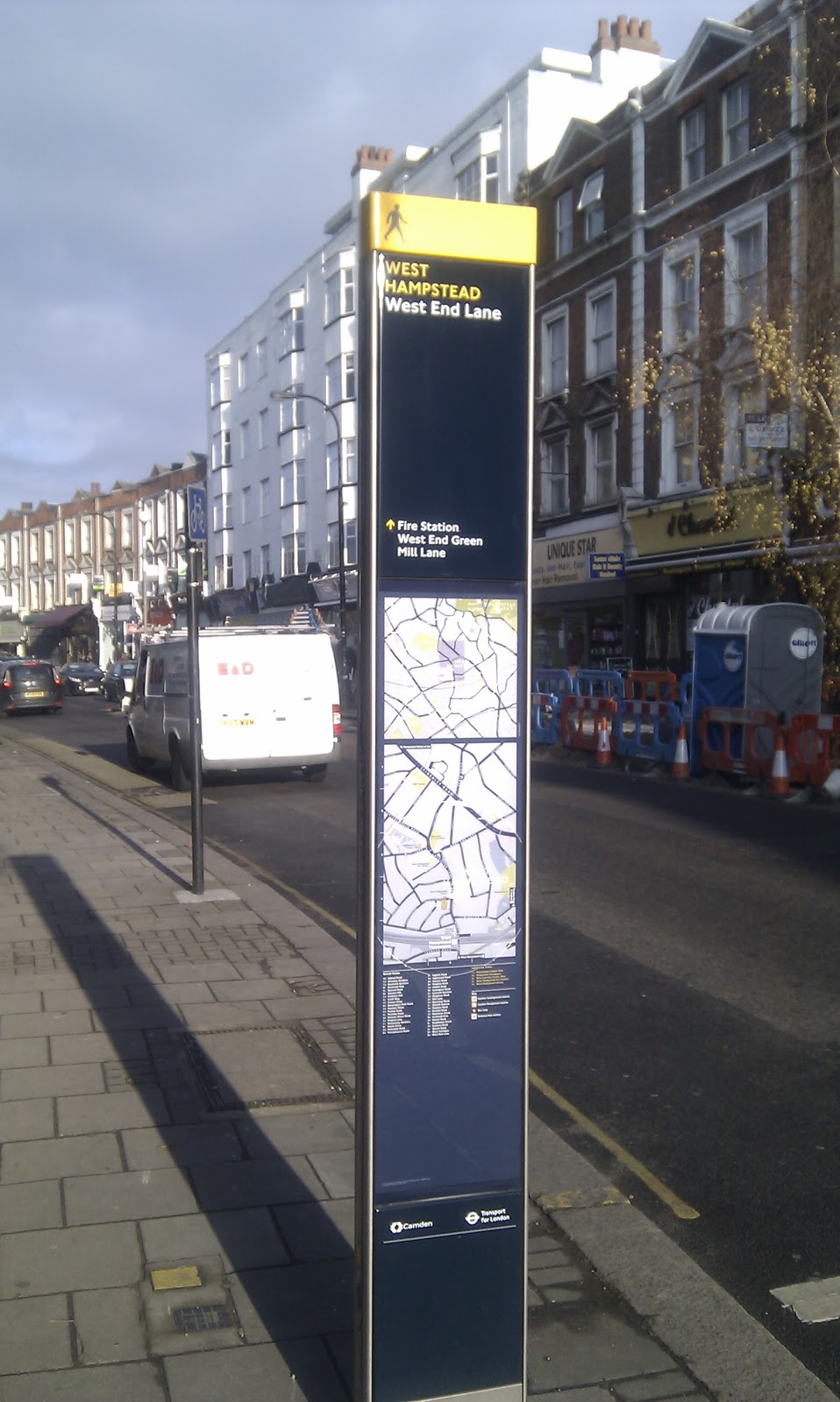
| A beacon of info on Hemstal Rd |
 |
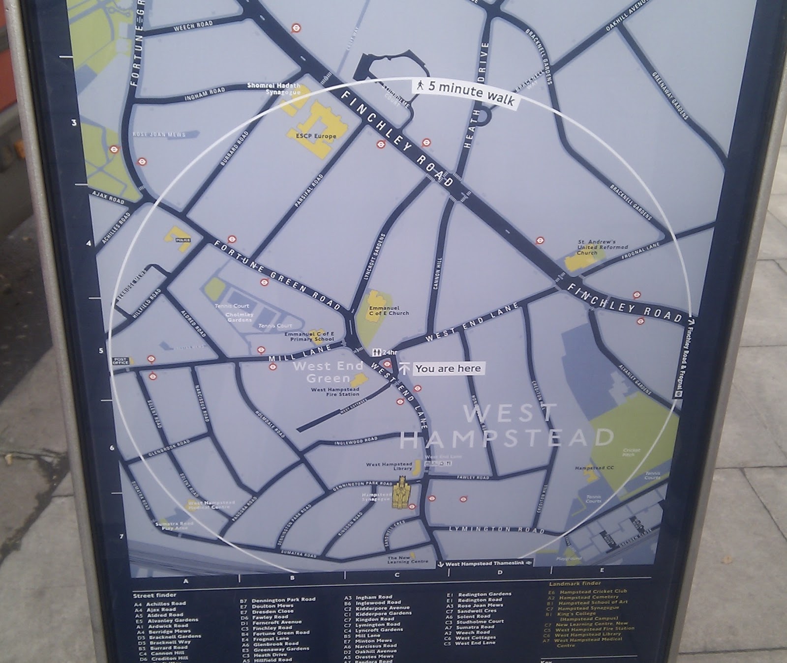
| Five minutes as the crow flies not as the pedestrian walks |
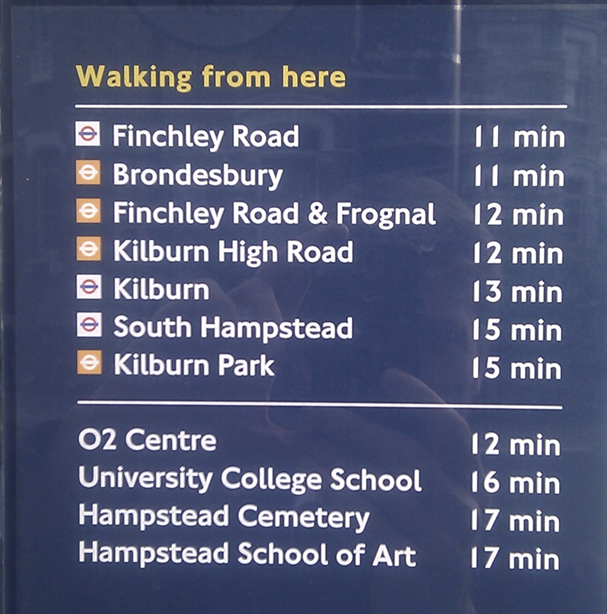 |
| Hampstead School of Art?? |
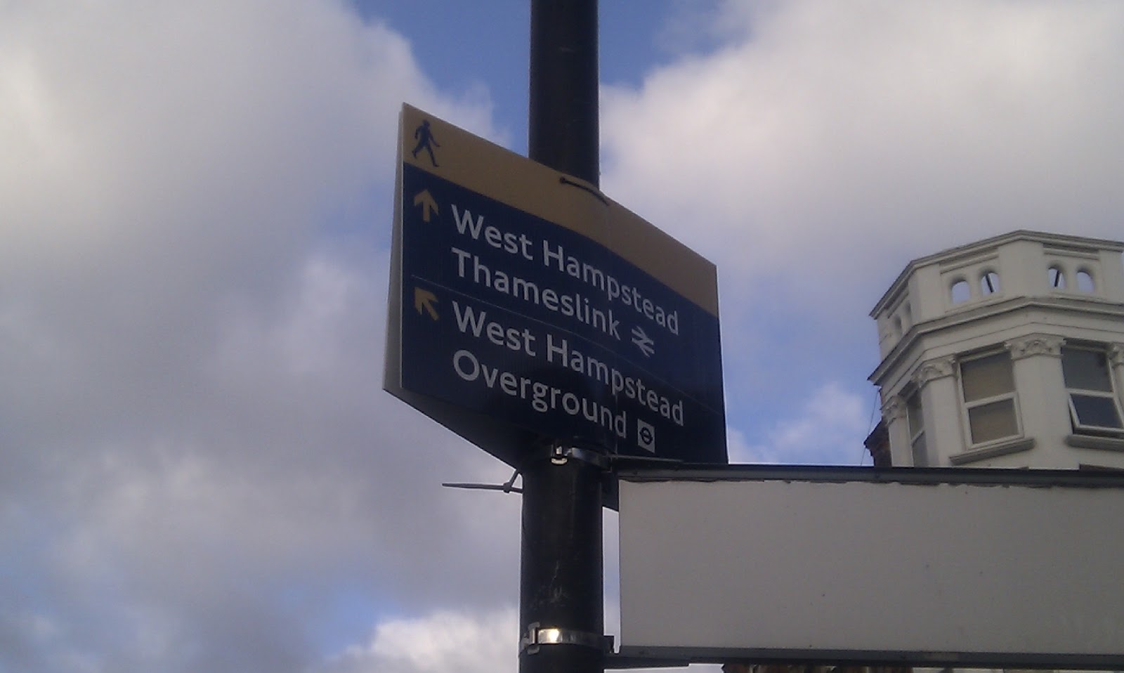
Apparently there is supposed to be a sign installed at the top of Blackburn Road, which is the most obvious place to put one although the pavement is already quite narrow and crowded there. There is of course a map just inside the tube station anyway. The sign would hopefully replace this corrugated plastic sign that I suspect most people don’t even notice.
 |
| A basic (and largely redundant) sign high on a lampost at the top of Blackburn Road. |
 |
| Here’s the other side looking north |
There are two signs on Iverson Road. One on the corner with West End Lane, and one outside the Thameslink station. It seems unnecessary to have two so close together.
 |
| Austrian tourists peruse the Iverson Road map |
 |
| The times don’t tally with those from the previous sign |
 |
| This Thameslink board is about 20 seconds from the Iverson Road/WEL one |
The next one is outside the library, and is in the ultra-thin format.

The last one is tucked away by the bus stand by West End Green (and not at the junction with Mill Lane as the councillors seem to think). This is perhaps the most bizarrely located sign of all. You can’t get on or off a bus here, it’s just where the 139 waits before starting service. Kate Goodman, from Camden’s placeshaping initiative, told me that as part of the place plan and the need to raise awareness of the Mill Lane shops, she had liaised with the transport officers to get Mill Lane on the signage. This has happened on this northernmost sign, although there’s no mention of shops.
 |
| Handy for, er, no-one? |
While I was looking at this one, I got chatting to a woman. She was in two minds as to whether the whole idea was a waste of money or genuinely useful but was adamant that it would take her more than five minutes to walk up to the junction of Bracknell Gardens and Frognal Lane.
 |
| “Five minutes to the Finchley Road? Not with that hill!” |
It’s true that the pavement is very wide here, so the sign is not impeding anyone. But surely the sign should be either nearer the bus stop or preferably at the West End Lane / Mill Lane junction, where it’s also fairly wide. There could be an argument I suppose about sight lines at this busy junction, but it’s hard to imagine there couldn’t be a solution.
 |
| Wide pavement at the corner of Mill Lane / West End Lane |
Overall, as I guess comes across, I think these signs have been plonked on our streets with not enough consideration given to their purpose or location. Having more streetmaps available is a good thing, although in another five years even more of us will be used to using our smartphones to navigate around unfamiliar areas. One wonders therefore whether the cost of designing and installing them in less touristy areas such as West Hampstead justifies the benefits. No-one seems able to tell me what the cost actually is – at least it’s coming from TfL and not the council’s tightly stretched budget.


